Back To Basic: Mental Model to Understand Flexbox
These are the mental models that I use to really understand flexbox, and I hope these can help you to understand too.

Mental models are personal, internal representations of external reality that people use to interact with the world around them. They are constructed by individuals based on their unique life experiences, perceptions, and understandings of the world. These are the mental model that I use to really understand flexbox, and I hope these can help you to understand too.
In this flexbox tutorial we will try to understand these properties & topics
- Flex Direction
- Justify Content
- Align Items
- How Flexbox Divides its children
- Flex Grow vs Width: 100%
Flex Direction
There are 4 values for flex-direction property which are:
- column
- row
- column-reversed
- row-reversed
flexbox.help has a great interactive illustration if you want to check it out. These are all the output I reproduced:

Looking at the property's value, it is kind of confusing, because if we assign flex-direction: row it is stacked to the right.
But here is the mental model to understand and to remember it. I want you to remember that we are putting the flex-direction to the red box, not the items. According to that, we are basically telling the red box to be a single row. Think of it as an excel spreadsheet. If the red box is a single row, we can only put elements to the right, like the excel spreadsheet.

Got it?
flex-direction: column is basically the same, you are telling the red box to be a single column in a spreadsheet, then you can only add items to the bottom.
As for the column-reverse, and the row-reverse, I think you already got the hang of it, just reverse it.
Justify Content
Justify content is the property to move items around on the main axis. What is the main axis? The main axis is the direction we declare using flex-direction. For example with the same illustration on top, when we declare flex-direction: row, then the main axis is horizontal or to left-right.
Here is a great illustration from css-tricks.

The mental model I use to remember this is, Justify Content moves around items on the main axis.
I think the values of the property is very clear on the illustration.
Align Items
This is the opposite of justify-content but align-items do not have all property from justify-content. Align items work on the cross axis. Which is the opposite of our main axis.

Same with justify-content mental model, you only need to remember that Align Items work on the cross axis.
How Flexbox divide its children
We have a red box with 500px width, and 5 items with each 100px width.

with code:
<div class="red-box">
  <div class="item">
    <p>1</p>
  </div>
  <div class="item">
    <p>2</p>
  </div>
  <div class="item">
    <p>3</p>
  </div>
  <div class="item">
    <p>4</p>
  </div>
  <div class="item">
    <p>5</p>
  </div>
</div>

<style>
  .red-box {
    width: 500px;
    display: flex;
  }
  .item {
    width: 100px;
  }
</style>
I like to create a mental model where each item is requesting to the red box (which will we call Reddy for short) how much do they need.
In the beginning Reddy is 500px wide, and each items is requesting 100px.
Reddy: 500px

Request List:
1,2,3,4,5: 100px
Because Reddy has 500px space, so Reddy gives each item the requested amount, which is 100px.
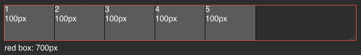
Case 1: When Reddy's width is larger than the requested amount
Let's say that Reddy is 700px, Reddy will still only give the items the requested amount which is 100px and has some spare spaces.
Case 2: When Reddy's width is smaller than the requested amount
When Reddy has limited width, Reddy must give each item a fair amount of width according to the request ratio.
Now, how do we calculate the ratio? That's quite easy, we need to find the ratio of all the requests, so:
Item1 : Item2 : Item3 : Item4 : Item5 = 1 : 1 : 1 : 1 : 1
So, from the ratio, Reddy will give each items equally.


Firefox Devtool also has a nice information on how much each elements shrinks.
Now, how small will Reddy give to each item? The items really care about the content they have, they don't want the content that they bring to get shrunk into non-existent

This illustration demonstrates that items won't shrink smaller than their content size, which in this case is 35px. Shrinking to content will create overflow.
Case 3: Different Request Ratio
We already know if the ratio is 1:1:1:1:1, it will shrink the items into equal sizes, let's see how they work when the item requests are not identical.
Reddy: 700px

Request List:
1,3,5: 100px
2,4: 200px
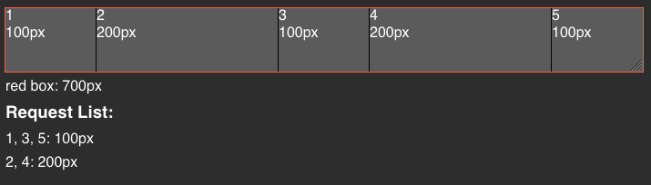
Let's calculate the request ratio:
Item Number = Ratio
1:2:3:4:5 = 100px:200px:100px:200px:100px
simplified,
1:2:3:4:5 = 1:2:1:2:1
So, Reddy will give the items according to that list.
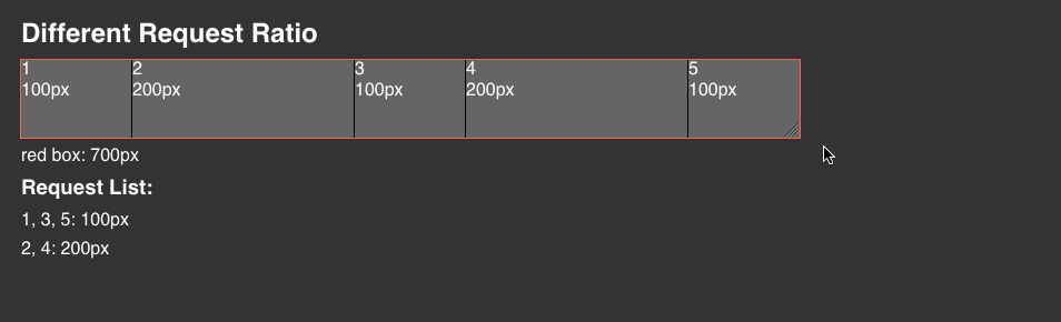
As we can see, when Reddy gets shrunk to 350px, the item sizes will be: 50 : 100 : 50 : 100 : 50, identical to the request ratio.
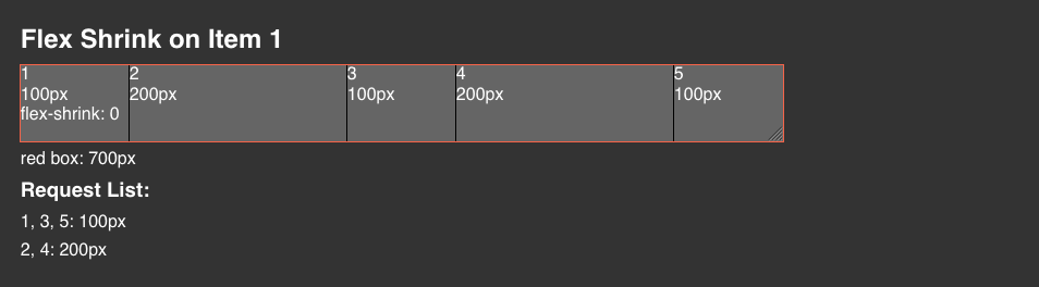
You can also force the item to not shrink according to the requested width using flex-shrink: 0 on the .item. Reddy will recognize the item as a VIP Member, and won't shrink it no matter what.
Flex Grow vs Width 100%

Using width: 100% basically will translate to 100% of the container which is 500px. By doing that, this means that width: 100% will get calculated in the request ratio which is 1:5:1.
But, using flex-grow: 1, the items will not get calculated in the request ratio, but takes the rest of whatever is left.
Summary
There you go, after I understand how flexbox actually works, working with flexbox is a breeze. I also have a blog post on how to choose between flex and grid, you might want to check it out.
Let me know if you guys have some question!
Originally posted on my personal site, find more blog posts and code snippets library I put up for easy access on my site 🚀
Like this post? Subscribe to my newsletter to get notified every time a new post is out!