# Step by step: How to setup Storybook with Next.js and Tailwind CSS
## Introduction
Storybook is a great way to maintain and preview isolated components. I usually add it as a 'nice-to-have' feature. During set up, I found that the resource about setting up a storybook with Next.js and Tailwind CSS is **scarce**. There are a bunch of bugs, and finding the solution is like finding a needle in a haystack. Hopefully, this tutorial can help you set it up smoothly.
## Version
This step-by-step tutorial is written with **Storybook v6.4.9 & TypeScript**, if you found the tutorial is not working after some minor update, please leave a comment below.
## Initializing Storybook
This command will install the storybook to your Next.js repository, there will be a prompt asking if you want to additionally install an eslint plugin, I suggest you accept.
```bash
npx -y sb init --builder webpack5
```
## Installing PostCSS Add-ons
Tailwind CSS needs PostCSS to work, so we need to integrate it with Storybook using one of their pre-built add-ons.
```bash
yarn add -D @storybook/addon-postcss
```
## Adding Webpack as a resolution dependency
We need this to ensure the webpack is installed as a dependency, somehow this will cause a bug if we don’t install it
Append this to your package.json
```json
// package.json
"resolutions": {
"webpack": "^5"
}
```
Then install the webpack resolutions with
```json
yarn
```
## Replace `.storybook/main.js`
Here is the custom main.js config that you can use
```jsx
// .storybook/main.js
const path = require('path');
module.exports = {
stories: ['../src/**/*.stories.mdx', '../src/**/*.stories.@(js|jsx|ts|tsx)'],
staticDirs: ['../public'],
addons: [
'@storybook/addon-links',
'@storybook/addon-essentials',
{
/**
* NOTE: fix Storybook issue with PostCSS@8
* @see https://github.com/storybookjs/storybook/issues/12668#issuecomment-773958085
*/
name: '@storybook/addon-postcss',
options: {
postcssLoaderOptions: {
implementation: require('postcss'),
},
},
},
],
core: {
builder: 'webpack5',
},
webpackFinal: (config) => {
/**
* Add support for alias-imports
* @see https://github.com/storybookjs/storybook/issues/11989#issuecomment-715524391
*/
config.resolve.alias = {
...config.resolve?.alias,
'@': [path.resolve(__dirname, '../src/'), path.resolve(__dirname, '../')],
};
/**
* Fixes font import with /
* @see https://github.com/storybookjs/storybook/issues/12844#issuecomment-867544160
*/
config.resolve.roots = [
path.resolve(__dirname, '../public'),
'node_modules',
];
return config;
},
};
```
I've provided some comments about the bug fixes with the link.
Confirm the `stories` and `staticDirs` if they match up with your folder structure. By specifying `staticDirs` we can use assets from public folders.
## Replace `.storybook/preview.js`
```jsx
// .storybook/preview.js
import '../src/styles/globals.css';
import * as NextImage from 'next/image';
const OriginalNextImage = NextImage.default;
Object.defineProperty(NextImage, 'default', {
configurable: true,
value: (props) => ,
});
export const parameters = {
actions: { argTypesRegex: '^on[A-Z].*' },
controls: {
matchers: {
color: /(background|color)$/i,
date: /Date$/,
},
},
previewTabs: {
'storybook/docs/panel': { index: -1 },
},
};
```
I like the docs panel to be the default so I added the `previewTabs` config. You can remove it if you want.
This file will load the Tailwind CSS from `globals.css` and mock `NextImage` to work with Storybook.
## Running the storybook
Run `yarn storybook`to start up the dev server.
Then you can start adding some story, here is an example
### Story example
```tsx
// src/components/buttons/__stories__/Button.stories.tsx
import { ComponentMeta, ComponentStory } from '@storybook/react';
import * as React from 'react';
import { HiSearch } from 'react-icons/hi';
import Button from '@/components/buttons/Button';
export default {
title: 'Components/Buttons/Button',
component: Button,
argTypes: {
children: {
control: { type: 'text' },
},
},
} as ComponentMeta;
const Template: ComponentStory = (args) => ;
export const Default = Template.bind({});
Default.args = {
children: 'Button',
variants: 'primary',
};
export const WithIcon = Template.bind({});
WithIcon.args = {
children: (
Search
),
};
```
### Type Definition
```tsx
type ButtonProps = {
/** Button children element */
children: React.ReactNode;
/** Show loading spinner and disable button */
isLoading?: boolean;
/** Button color variant */
variants?: 'primary' | 'secondary';
/** Disable the button and add not-allowed cursor */
disabled?: boolean;
} & React.ComponentPropsWithoutRef<'button'>;
```
If you are using TypeScript, you can directly add JSDoc to the type definition, and it will automatically generate the props description 🤯
### Screenshot
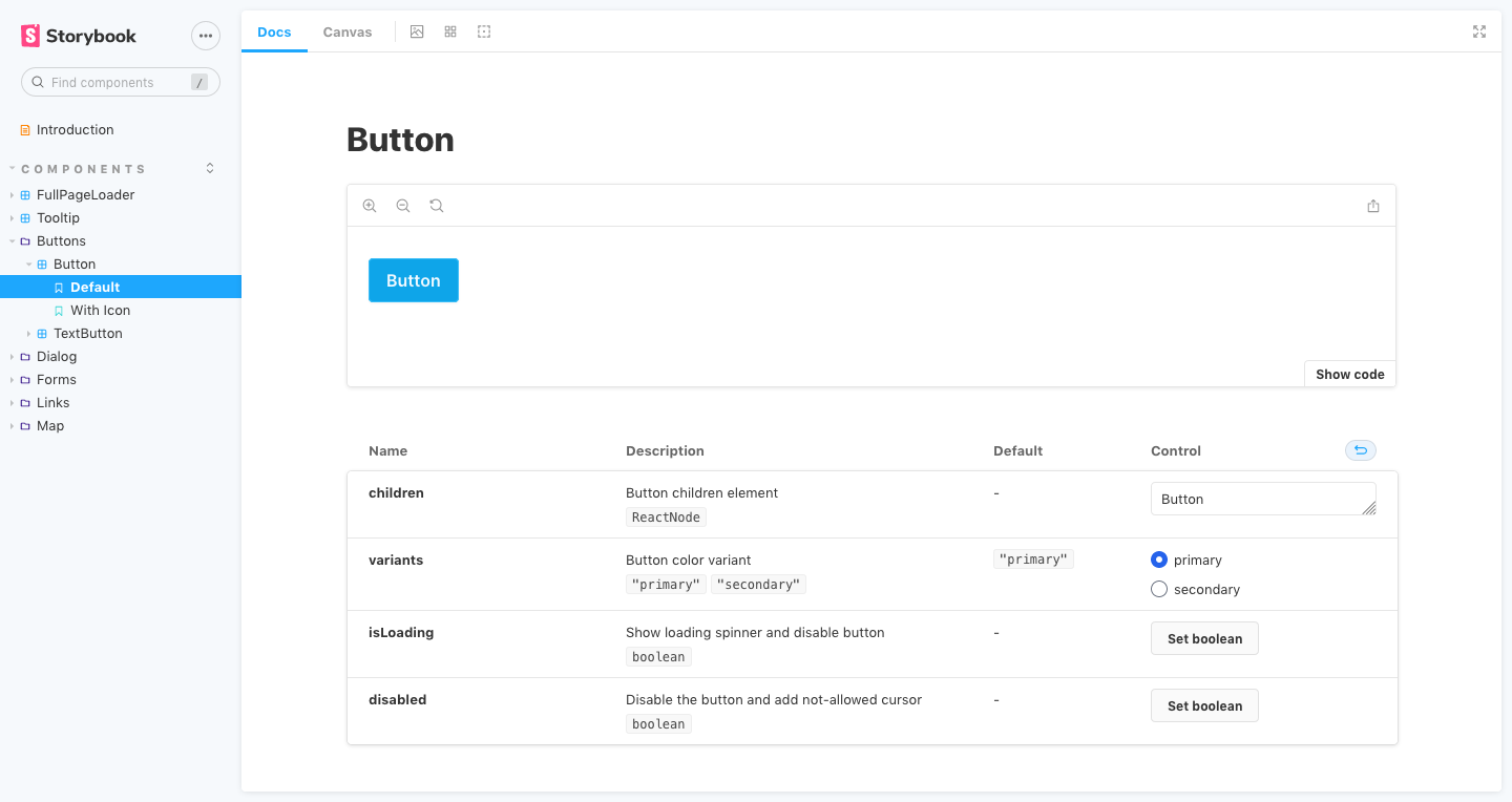
Awesome.
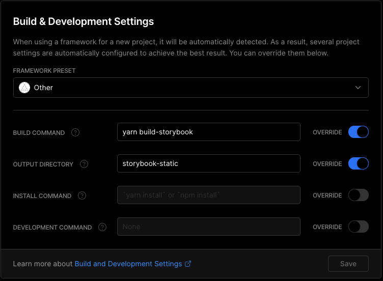
## Deploying on Vercel
To deploy on Vercel, you need to create a separate deployment with your Next.js page, then add this custom configuration
## Hate config? Use my starter & expansion
This is a battery-packed starter with installable expansion just by using a single command in the terminal.
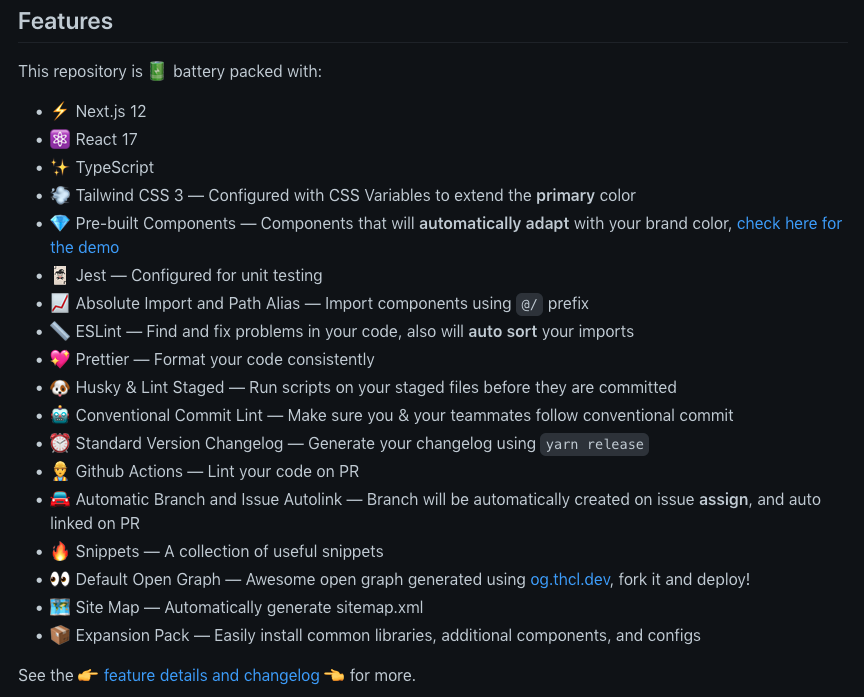
Check out the [ts-nextjs-tailwind-starter](https://github.com/theodorusclarence/ts-nextjs-tailwind-starter)!
### Storybook Expansion
I created this expansion to easily configure the project, this will do all of the above tutorials, suitable to be used with my starter, you _probably_ can use it to an existing project. No promise ✌
```bash
curl -s https://raw.githubusercontent.com/theodorusclarence/expansion-pack/main/storybook/trigger.sh | bash -s
```
[Expansion pack repository](https://github.com/theodorusclarence/expansion-pack#storybook)
### Plop Generator
The expansion pack is also equipped with a [plop](http://plopjs.com?ref=theodorusclarence.com) generator to easily create a storybook file for your component
{% youtube t-MnpB7rOhg %}
---
> Originally posted on [my personal site](https://theodorusclarence.com/?ref=devto), find more [blog posts](https://theodorusclarence.com/blog?ref=devto) and [code snippets library](https://theodorusclarence.com/library?ref=devto) I put up for easy access on my site 🚀
Like this post? [Subscribe to my newsletter](https://theodorusclarence.com/subscribe?ref=devto) to get notified every time a new post is out!