Step by step: How to setup Storybook with Next.js and Tailwind CSS

Introduction
Storybook is a great way to maintain and preview isolated components. I usually add it as a 'nice-to-have' feature. During set up, I found that the resource about setting up a storybook with Next.js and Tailwind CSS is scarce. There are a bunch of bugs, and finding the solution is like finding a needle in a haystack. Hopefully, this tutorial can help you set it up smoothly.
Version
This step-by-step tutorial is written with Storybook v6.4.9 & TypeScript, if you found the tutorial is not working after some minor update, please leave a comment below.
Initializing Storybook
This command will install the storybook to your Next.js repository, there will be a prompt asking if you want to additionally install an eslint plugin, I suggest you accept.
npx -y sb init --builder webpack5
Installing PostCSS Add-ons
Tailwind CSS needs PostCSS to work, so we need to integrate it with Storybook using one of their pre-built add-ons.
yarn add -D @storybook/addon-postcss
Adding Webpack as a resolution dependency
We need this to ensure the webpack is installed as a dependency, somehow this will cause a bug if we don’t install it
Append this to your package.json
// package.json

"resolutions": {
    "webpack": "^5"
}
Then install the webpack resolutions with
yarn
Replace .storybook/main.js
Here is the custom main.js config that you can use
// .storybook/main.js

const path = require('path');

module.exports = {
  stories: ['../src/**/*.stories.mdx', '../src/**/*.stories.@(js|jsx|ts|tsx)'],
  staticDirs: ['../public'],
  addons: [
    '@storybook/addon-links',
    '@storybook/addon-essentials',
    {
      /**
       * NOTE: fix Storybook issue with PostCSS@8
       * @see https://github.com/storybookjs/storybook/issues/12668#issuecomment-773958085
       */
      name: '@storybook/addon-postcss',
      options: {
        postcssLoaderOptions: {
          implementation: require('postcss'),
        },
      },
    },
  ],
  core: {
    builder: 'webpack5',
  },
  webpackFinal: (config) => {
    /**
     * Add support for alias-imports
     * @see https://github.com/storybookjs/storybook/issues/11989#issuecomment-715524391
     */
    config.resolve.alias = {
      ...config.resolve?.alias,
      '@': [path.resolve(__dirname, '../src/'), path.resolve(__dirname, '../')],
    };

    /**
     * Fixes font import with /
     * @see https://github.com/storybookjs/storybook/issues/12844#issuecomment-867544160
     */
    config.resolve.roots = [
      path.resolve(__dirname, '../public'),
      'node_modules',
    ];

    return config;
  },
};
I've provided some comments about the bug fixes with the link.
Confirm the stories and staticDirs if they match up with your folder structure. By specifying staticDirs we can use assets from public folders.
Replace .storybook/preview.js
// .storybook/preview.js

import '../src/styles/globals.css';
import * as NextImage from 'next/image';

const OriginalNextImage = NextImage.default;

Object.defineProperty(NextImage, 'default', {
  configurable: true,
  value: (props) => <OriginalNextImage {...props} unoptimized />,
});

export const parameters = {
  actions: { argTypesRegex: '^on[A-Z].*' },
  controls: {
    matchers: {
      color: /(background|color)$/i,
      date: /Date$/,
    },
  },
  previewTabs: {
    'storybook/docs/panel': { index: -1 },
  },
};
I like the docs panel to be the default so I added the previewTabs config. You can remove it if you want.
This file will load the Tailwind CSS from globals.css and mock NextImage to work with Storybook.
Running the storybook
Run yarn storybookto start up the dev server.
Then you can start adding some story, here is an example
Story example
// src/components/buttons/__stories__/Button.stories.tsx

import { ComponentMeta, ComponentStory } from '@storybook/react';
import * as React from 'react';
import { HiSearch } from 'react-icons/hi';

import Button from '@/components/buttons/Button';

export default {
  title: 'Components/Buttons/Button',
  component: Button,
  argTypes: {
    children: {
      control: { type: 'text' },
    },
  },
} as ComponentMeta<typeof Button>;

const Template: ComponentStory<typeof Button> = (args) => <Button {...args} />;

export const Default = Template.bind({});
Default.args = {
  children: 'Button',
  variants: 'primary',
};

export const WithIcon = Template.bind({});
WithIcon.args = {
  children: (
    <div className='flex gap-2 items-center'>
      <HiSearch />
      <span>Search</span>
    </div>
  ),
};
Type Definition
type ButtonProps = {
  /** Button children element */
  children: React.ReactNode;
  /** Show loading spinner and disable button */
  isLoading?: boolean;
  /** Button color variant */
  variants?: 'primary' | 'secondary';
  /** Disable the button and add not-allowed cursor */
  disabled?: boolean;
} & React.ComponentPropsWithoutRef<'button'>;
If you are using TypeScript, you can directly add JSDoc to the type definition, and it will automatically generate the props description 🤯
Screenshot
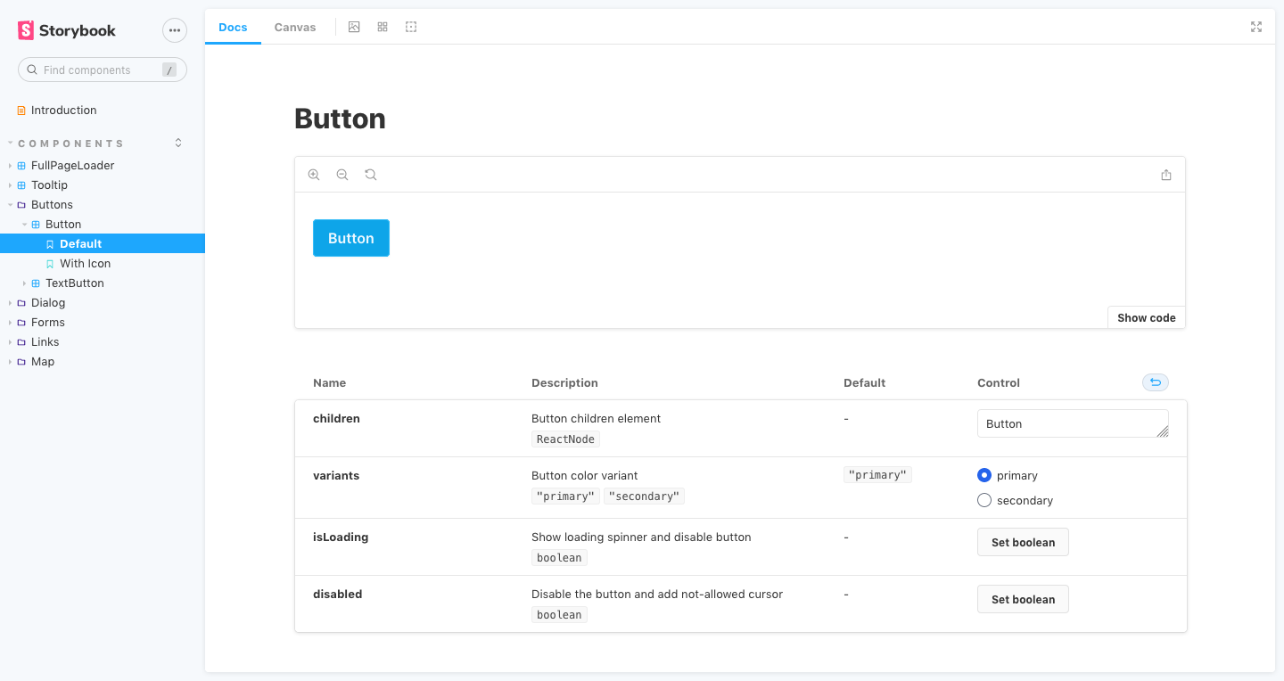
Awesome.
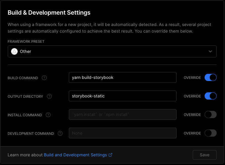
Deploying on Vercel
To deploy on Vercel, you need to create a separate deployment with your Next.js page, then add this custom configuration
Hate config? Use my starter & expansion
This is a battery-packed starter with installable expansion just by using a single command in the terminal.
Check out the ts-nextjs-tailwind-starter!
Storybook Expansion
I created this expansion to easily configure the project, this will do all of the above tutorials, suitable to be used with my starter, you probably can use it to an existing project. No promise ✌
curl -s https://raw.githubusercontent.com/theodorusclarence/expansion-pack/main/storybook/trigger.sh | bash -s
Plop Generator
The expansion pack is also equipped with a plop generator to easily create a storybook file for your component
{% youtube t-MnpB7rOhg %}
Originally posted on my personal site, find more blog posts and code snippets library I put up for easy access on my site 🚀
Like this post? Subscribe to my newsletter to get notified every time a new post is out!